
iOS 26 Beta 3 Tones Down Liquid Glass Effect
Apple continues to refine its new Liquid Glass design with the release of iOS 26 Beta 3, addressing additional user concerns about clarity and readability. While Beta 2 tackled excessive transparency in the Control Center, the latest update shifts attention to other parts of the system, such as Notifications and navigation elements in Apple’s own apps, including Apple Music. For example, the navigation bar in the Music app now features a more opaque, solid white background, replacing the semi-transparent effect that previously allowed background content to show through.
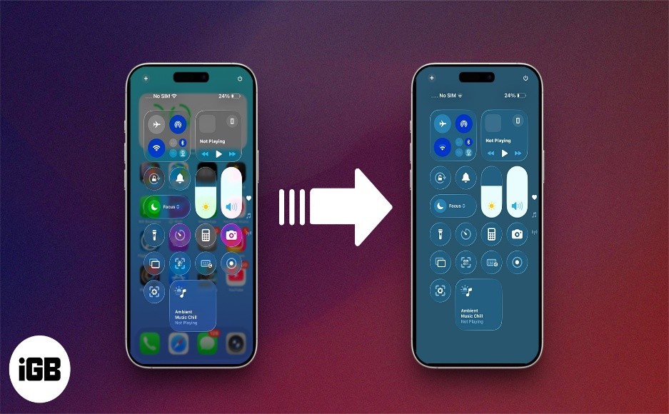
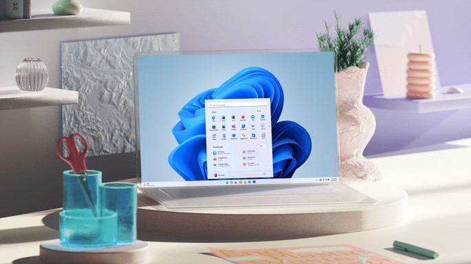
Figure 1. iOS 26 Beta 3 Softens Liquid Glass Design for Better Readability.
While the adjustments may have improved readability, some users now feel Apple has swung too far in the opposite direction, reverting to a more subdued “frosted glass” appearance. Figure 1 shows iOS 26 Beta 3 Softens Liquid Glass Design for Better Readability
It’s important to keep in mind that these are still developer betas—early previews of the operating system intended for testing and feedback. Their purpose is to help Apple identify bugs, gather user input, and make refinements ahead of the official launch this fall.
As such, the look and feel of Liquid Glass is likely to evolve further in upcoming beta releases, as Apple continues to fine-tune the design to strike the right balance across apps and interface elements.
What Is Liquid Glass?
Introduced at WWDC 2025, Liquid Glass is Apple’s new design language for iOS 26. Inspired by the way real glass refracts and diffuses light, it brings translucent, light-reactive layers to the user interface. The goal was to create a more immersive, fluid visual experience—but not everyone loved it.
Why Users Pushed Back
In the first developer beta, many users found Liquid Glass made the interface too transparent, especially in areas like the Control Center and Notifications. Icons and widgets behind these layers created visual clutter, reducing legibility and making navigation harder—especially for users with accessibility needs.
Apple’s First Fix – Beta 2
Apple responded in iOS 26 Beta 2 by dialing back transparency in the Control Center. The change added more contrast and reduced visual noise, making key functions easier to see and interact with. It was the first sign Apple was actively listening to feedback during the beta cycle.
Beta 3 Expands the Fix
In Beta 3, Apple widened its adjustments beyond the Control Center. Notifications and first-party apps like Apple Music also received refinements. For instance, the navigation bar in Apple Music now features a solid white background instead of a see-through one, improving text clarity and user comfort.
What to Expect Going Forward
Some users now feel Apple may have pulled back too much, reverting to a "frosted glass" look that loses the original flair. But this is what betas are for—testing boundaries. With months to go before iOS 26’s public release in the fall, Apple is likely to continue tweaking Liquid Glass to strike a better balance between style and usability.
Source:TC
Cite this article:
Priyadharshini S (2025), iOS 26 Beta 3 Tones Down Liquid Glass Effect, AnaTechMaz, pp.271
Recent Post
-
iOS 26 Beta 3 Tones Down Liquid Glass Effect
Apple continues to refine its new Liquid Glass design with the release of iOS 26 Beta.....
-
Beware: That ‘Unsubscribe’ Button Could Be a Scam
Most legitimate bulk emails—like newsletters, promotional offers streaming service updates.....
-
Google Veo 3 Now Available in India: Here's How to Get Started
Google has officially released Veo 3—its latest AI-powered video generation tool—in.....
-
Anthropic Quietly Imposes Stricter Usage Limits on Claude Code
Since Monday morning, users of Claude Code have encountered unexpected.....
-
Why A Y Combinator Startup Abandoned Its AI Agent For Windows and Pivoted
Pig.dev, a startup from Y Combinator’s Winter 2025 batch, initially....
-
Google Photos Introduces AI Tools To Remix Photos and Transform Them into Videos
Google Photos is getting a creative AI boost. The company announced....
-
Google's New AI-Powered Web Guide Experiment Reshapes Search Results
On Thursday, Google introduced a new AI-driven feature called.....

Mozilla Firefox Users, Beware! Government Alerts on Critical Browser Security Flaws — How to Protect Yourself
If you use Mozilla Firefox...
WhatsApp May Soon Allow Two Accounts on One iPhone: Here’s What to Expect
A new feature will let users add a second WhatsApp account using a.....
Perplexity AI Brings Task Scheduling to WhatsApp Chatbot: How to Use It
Perplexity AI’s WhatsApp bot now supports custom task scheduling.....
-
WhatsApp’s New Meta AI Feature Can Summarize Unread Messages
WhatsApp has launched a new feature called Message Summaries, powered.....
-
ElevenLabs Unveils Mobile App for AI Voice Creation
ElevenLabs has released a new mobile app for Android and iOS that lets users easily convert.....
-
OpenAI Tests ChatGPT's 'Study Together' Feature: How It Works
Some ChatGPT users have noticed a new feature called 'Study Together,' which takes a more.....
-
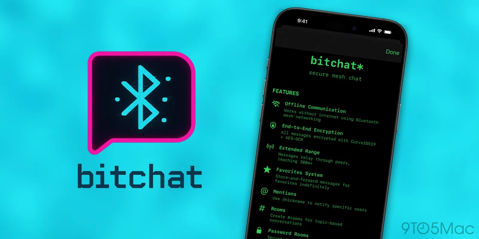
Jack Dorsey’s New App 'Bitchat' Enables Messaging Without Internet
Bitchat uses Bluetooth mesh networking to enable peer.....
-
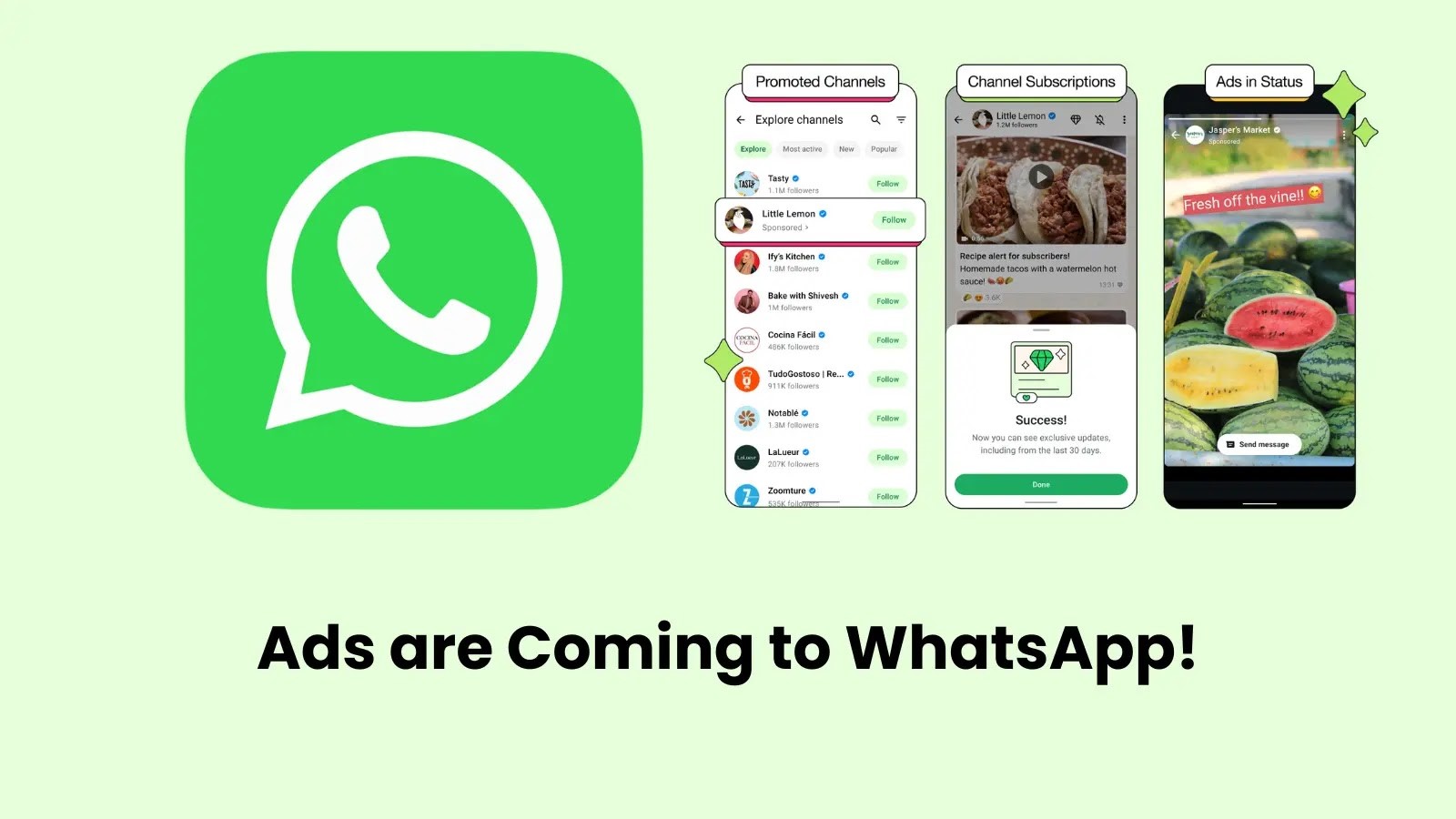
WhatsApp to Launch Ads and Paid Subscription Options Soon
On Monday, June 16, WhatsApp announced plans to introduce ads and paid.....