
Benefits of Data visualization
Data visualization is the graphical representation of information and data. By using visual elements like charts, graphs, and maps, data visualization tools provide an accessible way to see and understand trends, outliers, and patterns in data.
In the world of Big Data, data visualization tools and technologies are essential to analyze massive amounts of information and make data-driven decisions.
As the “age of Big Data” kicks into high-gear, visualization is an increasingly key tool to make sense of the trillions of rows of data generated every day. Data visualization helps to tell stories by curating data into a form easier to understand, highlighting the trends and outliers. A good visualization tells a story, removing the noise from data and highlighting the useful information. However, it’s not simply as easy as just dressing up a graph to make it look better or slapping on the “info” part [1] of an infographic. Effective data visualization is a delicate balancing act between form and function. The plainest graph could be too boring to catch any notice or it make tell a powerful point; the most stunning visualization could utterly fail at conveying the right message or it could speak volumes. The data and the visuals need to work together, and there’s an art to combining great analysis with great storytelling.
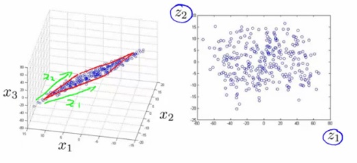
It’s hard to think of a professional industry that doesn’t benefit from making data more understandable. Every STEM field benefits from understanding data—and so do fields in government, finance, marketing, history, consumer goods, service industries, education, sports, and so on. While we’ll always wax poetically about data visualization (you’re on the Tableau website, after all) there are practical, real-life applications that are undeniable. And, since visualization is so prolific, it’s also one of the most useful professional skills to develop. The better you can convey your points visually, whether in a dashboard or a slide deck, the better you can leverage that information. The concept of the citizen data scientist is on the rise. Skill sets are changing to accommodate [2] a data-driven world. It is increasingly valuable for professionals to be able to use data to make decisions and use visuals to tell stories of when data informs the who, what, when, where, and how. While traditional education typically draws a distinct line between creative storytelling and technical analysis, the modern professional world also values those who can cross between the two: data visualization sits right in the middle of analysis and visual storytelling figure1 shown given below.
Data visualizations can come in many different forms. People are always coming up with new and creative ways to present data visually.
- Statistical infographics
- Informational infographics
- Timeline infographics
- Process infographics
- Geographic infographics
- Comparison infographics
- Hierarchical infographics
- Resume infographics
- Resume infographics

Figure1: Data Visualization
- Making the baselines something other than 0 to make numbers seem bigger or smaller than they are – this is called “truncating” a graph
- Compressing or expanding the scale of the Y-axis to make a line or bar seem bigger or smaller than it should be
- Cherry picking data so that only the data points you want to include are on a graph (i.e. only telling part of the story)
- Using the wrong type of chart, graph or diagram for your data
- Going against standard, expected data visualization conventions
Because people use data visualizations to reinforce their opinions, you should always read data visualizations with a critical eye. Often enough, writers may be using data visualization to skew the data in a way that [3] supports their opinions, but that may not be entirely truthful.Data visualizations like infographics give you the space to combine data and narrative structure in one page. Visuals like icons and bold fonts let you highlight important statistics and facts.
Data visualizations like infographics give you the space to combine data and narrative structure in one page. Visuals like icons and bold fonts let you highlight important statistics and facts.
For example, you could customize this data visualization infographic template to show the benefit of using your product or service.
References:
- https://www.tableau.com/learn/articles/data-visualization
- https://www.javatpoint.com/what-is-data-visualization
- https://www.ibm.com/cloud/learn/data-visualization
Cite this article:
S Nandhinidwaraka (2021), Benefits of Data Visualization, pp. 11
Recent Post
-
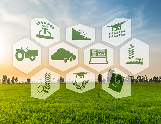
Data Science in Modern Agriculture
Agriculture is the backbone of the world economy, but the industry currently needs more support than any other...
-

Security Trends in Data Centers in 2021
Data center security is an ongoing challenge for virtually every modern organization.
-

Database Architecture
A Database Architecture is a representation of DBMS design. It helps to design, develop, implement, and maintain the database management system.
-
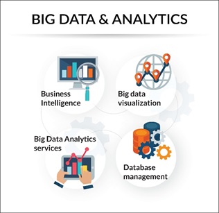
Big Data Analytics
Big data analytics is the use of advanced analytic techniques against very large, diverse data sets that include structured
-
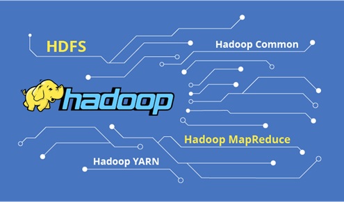
Hadoop
Apache Hadoop is an open source framework that is used to efficiently store and process large datasets ranging in size from gigabytes to petabytes of data.
-

Lifecycle: Big Data Analytics
Big Data analysis differs from traditional data analysis primarily due to the volume, velocity and variety characteristics of the data being processes.
-
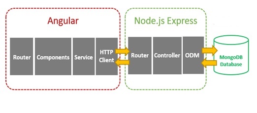
Angular vs Node JS
Angular is a platform for developing single-page applications with the use of TypeScript and HTML....
-
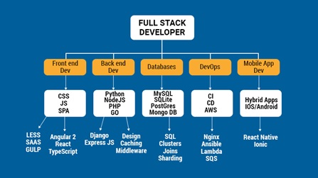
Full Stack Development
Full stack development: It refers to the development of both front end (client side) and back end (server side) portions of web application...
-
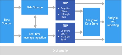
Methods of Natural Language Processing
Natural language processing strives to build machines that understand and respond to text or voice data...
-

A Deep Study of Data science
Data science is a deep study of the massive amount of data, which involves extracting meaningful insights from raw...
-
Benefits of Data visualization
Data visualization is the graphical representation...
-
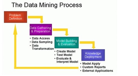
The Process of Data Mining
Data mining is more than just extracting or mining data...
-
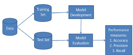
Benefits of Naive Bayes
Naive Bayes falls under the umbrella of supervised machine learning algorithms that are primarily used for classification...
-

Functions Of Data Warehouse Modernization
We’re living in times where big data and analytics are driving all business decisions and traditional...
-
Techniques Of Dimensionality Reduction Method
The number of input features, variables, or columns present in a given...