
What is KPI Dashboard & how to design
What is a KPI?
A key performance indicator is a measurable value that shows how effectively you’re meeting your goals. Think of KPIs as your company’s scorecard, a way of measuring whether or not you’re delivering on your objectives.[1]
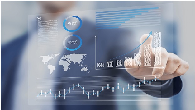
Figure. 1. KPI Dashboard
How Do You Measure KPIs?
It depends on the actual KPI being measured. But generally speaking, businesses measure and track KPIs through business analytics software and reporting tools[2]
How Do I Create a KPI Report?
- Create an overview or introduction
- Clearly define the KPIs
- Present your KPIs using appropriate graphs, charts, and tables
- Make final edits to the report and distribute
Different types of KPIs
- Quantitative KPIs are all about measurable facts that can be represented with a number. Think stats, percentages, and dollar signs.
- Qualitative KPIs involve human interpretations and can’t be quantified with numbers. Think opinions, feelings, and experiences.
- Lagging KPIs measure what’s already happened in the past to predict success or failure. Think of looking back at what you’ve already accomplished, or where you’ve struggled.
- Leading KPIs measure performance to predict future success and long-term trends. Think of looking forward to where you’re headed.
KPI Dashboard Design Principles
Designing a dashboard is about more than just making something look nice—it’s about using data to tell a story that helps your audience get what they need. Any data-driven dashboard must follow a few key design principles that add clarity and signal intent.
- Affordance Implement visual cues that indicate when an element links to another page, shows whether a button is active or inactive, or provides contextual information.
- Color accessibility or contrast Some people have a limited range of color vision, so it’s important to incorporate shapes and contrast to ensure that everyone can access the information they need.
- Information hierarchy Show data in the order of importance, so users won’t miss what matters most. “F-scanning” is a common way people consume information—essentially, they scan horizontally across the page, and then down. Understanding more about this and other common scanning patterns can help you put what’s most relevant first.
- Simplicity A cluttered dashboard might show a lot of information—but it’s useless if those looking at it don’t understand what they’re seeing. Less is more, so avoid confusing 3-D graphics or cramming too much on a page.[3]
References:
- https://powerbi.microsoft.com/en-us/kpi-dashboards/#:~:text=KPI%20dashboards%20are%20tools%20that,KPIs%20and%20other%20business%20metrics.
- https://www.investopedia.com/terms/k/kpi.asp
- https://www.qlik.com/us/dashboard-examples/kpi-dashboards
Cite this article:
Nithyasri S (2022), What is KPI Dashboard & how to design , AnaTechMaz, pp. 127
Recent Post
-

Hyperautomation
Hyperautomation is a business-driven, disciplined approach that organizations use to rapidly identify, vet and automate as many......
-

Augmented Intelligence
Augmented intelligence is a design pattern for a human-centered partnership model of people and artificial intelligence (AI) working......
-

Indian SaaS firms using AI could create $500 billion of value by 2030: report
Mumbai: Indian software-as-a-service (SaaS) startups that harness ......
-

Industry 4.0 adoption can help manufacturing sector contribute 25% to GDP by FY26
The National Association of Software and Services ....
-
Infinix launches adoptive light paint leather technology
nfinix has unveiled Future Light-Paint Leather technology for adaptive color changing of leather coatings......
-

Instacart Launches Software Product for Retailers
The company announced that it wouldn't just be relying on the gig worker model anymore. Now,...
-
What is KPI Dashboard & how to design
A key performance indicator is a measurable value that shows how effectively you’re meeting your ....
-

L&T LaunchesCarbon and Water Neutrality
L&T Technology Services (LTTS) aims to achieve carbon and water neutrality by 2030 and has unveiled its .....
-
Lasso Loop Launches New Home Recycling Machine
Lasso is a small machine, having capabilities of industrial recycling machines and it will fit anywhere ....
-
Luminar Acquiring Leader in High-Performance Laser Chips
Luminar, a company that builds vision-based lidar and machine perception.....
-

Machine Learning Technology in Identifying Toxic in Water
A research team from the University of British Columbia, Okanagan Campus (UBCO)......
-
Magnetic Miniature Soft-Bodied Robots Can Move and Grab Things
Researchers from the Chinese University of Hong Kong have created a magnetic.......
-
MediaTek Announces First SoC Support for Dolby Vision IQ
Pentonic series of smart TV chips support advanced new imaging technologies.......
-
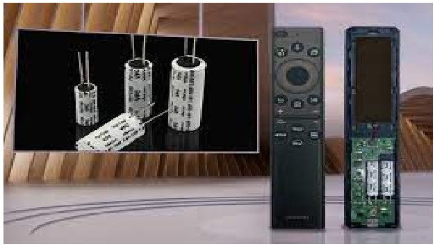
VPC Hybrid Capacitors from VINATech
VINATech Co. has announced that its VPC (Vina Pulse Capacitor) hybrid capacitors are being used in the .....
-
The Technology of Fibre with Fabrications
Scientists have created a fabric which can pick up sounds and could be used as a hearing aid, to monitor ......