
Power BI Key Influencers Visual: AI-powered visualisation
The Key influencers visual aids in comprehending the aspects that influence a metric of interest. It examines your information, rates the most important aspects, and displays them as key influencers.
Power BI created the Key Influencers visualization as a machine learning solution to allow businesses to leverage AI so that they can analyze their data in less time and make key business decisions faster. In other words, users can use Key Influencers to spend less time analyzing data and spend more time acting on the insights gathered from the AI visualization. [3].
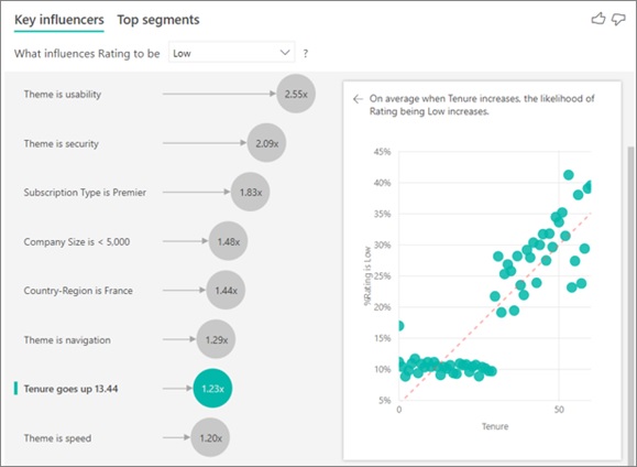
Figure 1. The Power BI Key Influencers Visual: AI-powered visualisation
Figure 1 shows using a Key Influencers Visual to analyse your data sets means you can identify and contrast the relative importance of influential factors, and which have the most relevance. It’s entirely AI-powered, with intelligence built-in that runs behind the scenes to help users find new insights..
While the public preview feature is still evolving and limited by a lack of consumption support for Power BI Embedded or Power BI Mobile and no support for metrics that are aggregate and measures, Microsoft have recently announced they are releasing two new companion AI visuals, Distribution Changes and Decomposition Tree, that further bolster Power BI..
- Distribution Change:. Will analyse what makes a distribution look different
- Decomposition Tree:. Will enable users to drill into any dimension to further understand what influencers drive a key metric in question. [1]
Features of the Key influencers visual
- There are two tabs to switch between views. Key influencers show the top contributors. Top segments show the top segments that contribute to the selected metric value .
- A dropdown box for what influences income level currently set to Average.
- Left Visual Restatement that helps to interpret the visual in the left pane: “When the likelihood of income level being average increases”.
- The Left pane shows a list of the top key influencers.
- Right Visual Restatement: “Income level is more likely to be average when Occupation is…”
- The right pane contains one visual. In this case, it is a column chart. The column chart displays values based on the selected key influencer in the left pane. Currently selected (as indicated by the aquamarine colour) is “Occupation is Professional”.
- The average line in the bar chart is calculated for all values other than the selected influencer.
- The Check box in the right pane is there for the option of only showing values that are influencers for that field. [2]
References:
- https://xo.xello.com.au/blog/power-bi-top-no-code-ai-and-machine-learning-features
- https://databear.com/key-influencers-power-bi-ai-visuals/
- https://datadojo.co.in/2021/06/28/power-bi-key-influencer-ai-driven-ml-visual/
Cite this article:
Thanusri swetha J (2022), Power BI Key Influencers Visual: AI-powered visualisation, AnaTechMaz, pp. 76
Recent Post
-
Power BI Key Influencers Visual: AI-powered visualisation
The focus of AI adoption is to improve the efficiency or effectiveness of operations......
-

Researcher Develop New AI-Powered Tool to Differentiate Between Fake Artworks
Art forgers had better watch their backs! Researchers .....
-

Researchers develop hybrid human-machine framework for building smarter AI
Artificial Intelligence (AI) plays a crucial role in multiple aspects of human life, from a......
-

Samsung Introduced Smart Monitor M8
Samsung, which had unveiled the M8 Smart Monitor at ......
-

Samsung Is Using AI To Enhance Picture Quality
AI models are decision-making algorithms which are skilled by way of a dataset.....
-

Secure Internet of Things Identities
The Internet-of-Things is extremely important today, and security is essential for a smooth.....
-

Intelligent Process Automation: The Engine at the core of the next-generation operating model
In essence, IPA “takes the robot out of the human.”
-

Smart phone cameras soon upgraded to the power of AI
Advanced internet of things (IoT) connectivity company Soracom has entered into
-

The Next Generation of Shape-Shifting Robots
A research team from the Universities of Bath and Birmingham are reinvent the way we design robots.
-
Trends on Artificial Intelligence in 2022
Artificial Intelligence and its subset Machine Learning are two technologies...
-

Using Real-Time AI to Secure Smart Home Device Data
The boom in smart devices, from light bulbs to robot vacuums to security cameras...
-

MIT AI Hardware Program Aims To Lead in Artificial Intelligence Technology Development
The MIT AI Hardware Program is a new academia and ...
-

Energy-efficient AI hardware technology via a brain-inspired stashing system
Researchers have proposed a novel system inspired by the......
-

'Nanomagnetic' computing can provide low-energy AI
Researchers have shown it is possible to perform artificial intelligence using tiny nanomagnets that interact......
-

5G and AI are helping build cars of the futuree
5G is expectedly the most disruptive technology, the world has seen in recent years...