
Data visualization
Data visualization software is a type of software tool that allows users to create visual representations of data in order to better understand and communicate complex information. These tools enable users to take large amounts of data and turn them into easy-to-understand charts, graphs, and other visualizations.
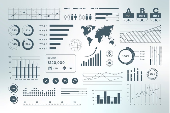
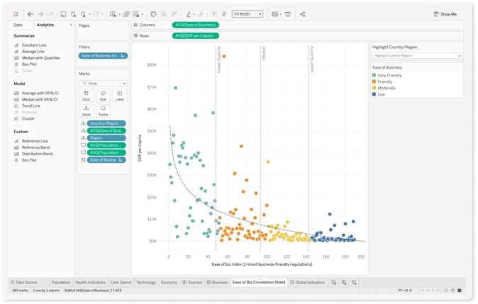
Figure 1. Data Visualization
Figure 1 is an example of Data visualization. Data visualization software is used across a wide range of industries, from business and finance to healthcare and government. These tools can help users identify patterns and trends in their data, and gain insights that can be used to optimize performance and make informed decisions.
Some common features of data visualization software include the ability to create interactive dashboards and reports, the ability to import data from multiple sources, and the ability to customize visualizations based on specific data sets or user preferences. Some tools also offer advanced features such as predictive analytics, machine learning, and natural language processing.
Examples of popular data visualization software include Tableau, Power BI, QlikView, and D3.js.
Tableau
Tableau is a Business Intelligence tool for visually analyzing the data. Users can create and distribute an interactive and shareable dashboard, which depict the trends, variations, and density of the data in the form of graphs and charts. Tableau can connect to files, relational and Big Data sources to acquire and process data. The software allows data blending and real-time collaboration, which makes it very unique. It is used by businesses, academic researchers, and many government organizations for visual data analysis. It is also positioned as a leader Business Intelligence and Analytics Platform in Gartner Magic Quadrant.
Power BI
Power BI is a Data Visualization and Business Intelligence tool that converts data from different data sources to interactive dashboards and BI reports. Power BI suite provides multiple software, connector, and services - Power BI desktop, Power BI service based on Saas, and mobile Power BI apps available for different platforms. These set of services are used by business users to consume data and build BI reports. This tutorial covers all the important concepts in Power BI and provides a foundational understanding on how to use Power BI.
QlikView
QlikView is a leading Business Discovery Platform. It is very powerful in visually analyzing the relationships between data. It does in-memory data processing and stores the data in the report itself that it creates. It can read data from numerous sources including files and relational databases. It is used by businesses to get deeper insight by doing advanced analytics on the data they have. It even does data integration by combining data from various sources into one QlikView analysis document. QlikView is a leading Business Intelligence and Analytics Platform in Gartner Magic Quadrant.
D3.js
D3 stands for Data-Driven Documents. D3.js is a JavaScript library for manipulating documents based on data. D3.js is a dynamic, interactive, online data visualizations framework used in a large number of websites. D3.js is written by Mike Bostock, created as a successor to an earlier visualization toolkit called Protovis. This tutorial will give you a complete knowledge on D3.jsframework. This is an introductory tutorial, which covers the basics of Data-Driven Documents and explains how to deal with its various components and sub-components.
These tools are designed to be user-friendly and accessible to a wide range of users, regardless of their technical background or experience with data analysis.
References:
- https://www.tutorialspoint.com/tableau/index.htm
- https://www.tutorialspoint.com/power_bi/index.htm
- https://www.tutorialspoint.com/qlikview/index.htm
- https://www.tutorialspoint.com/d3js/index.htm
Cite this article:
Hana M (2023), Data Visualization, AnaTechMaz, pp.38
Recent Post
-

AI-Driven Robots to Restock Shelves in Stores Across Japan
Telexistence Inc. and FamilyMart Co. are rolling out a fleet of AI...
-

World’s First Ever Task Mining Playbook Launched
Everest Group, a leading research firm, announced the launch of the...
-

A New 3D Printed Shoe that Adapts to the Functional Design of the Foot
Berlin and Munich based design studio Wertel Oberfell’s ...
-

Data Integration
Data integration is the process of combining data from different sources, formats, and locations...
-
Data Quality Management (DQM)
These days, data is the livelihood of any business. Data helps a company predict...
-

Actionable Analytics Everywhere
Actionable analytics is one of the hottest analytics and business intelligence trends in 2020 ...
-

Mobile BI
Mobile BI, or mobile business intelligence, refers to the use of mobile devices such as...
-
Data Visualization
Data visualization software is a type of software tool that ...
-

Self-Service BI Interfaces
Self-service business intelligence has been ...
-
Data Governance Will Be a Primary Ask When Seeking BI Software
Among trends in business intelligence, assigning dedicated data roles like that of data ...
-
Data Governance Will Be a Primary Ask When Seeking BI Software
Data storytelling is among popular business intelligence trends as companies seek to...
-

Data Warehouse
A data warehouse is a centralized repository of data that is used for reporting and analysis...
-
Tableau
Tableau is a business intelligence and data visualization software that helps people see and ....
-

Data Automation
Data Automation is interpreted as handling, uploading, and processing data utilizing ...
-

Data governance
Before we define data governance, let us establish what we mean by “data.” In terms of IT, ...